Easy Slider
A lightweight slider written in JavaScript with the help of jQuery.
To get a better understanding of JavaScript I decided to develop a little project in it. As we all know, in practice you learn things better. Well this slider plugin for jQuery is the result:
Features
- 100% responsive via css (no fake javascript usage for this)
- support for lazy loaded images
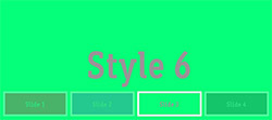
- six ready to use style templates
- optional navigation bar
- touch support
- many options for full control
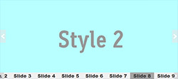
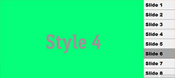
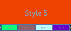
Ready To Use Themes


Quick Start
1. Put several images inside <div> tag. Note that every image must have the same size.
1. 2. 3. 4. 5. 6. 7. | <!-- create a div container which uses the class "es-slider" --> <div id="SliderID" class="es-slider"> <img src="/myImage_01.jpg" alt="Slide 1"/> <img src="/myImage_02.jpg" alt="Slide 2"/> <img src="/myImage_03.jpg" alt="Slide 3"/> <img src="/myImage_04.jpg" alt="Slide 4"/> </div> |
2. Init the slider via JavaScript. Usually when the document is ready.
1. 2. 3. 4. 5. 6. 7. 8. 9. 10. 11. | $(document).ready( function() { $("#SliderID).easySlider({ autoSlide: false, slideLoop: true, slideLoopRewind: false, navControl : { navBarOrientation: "horizontal", navBarStyle : "custom" } }); } ); |
3. Put everything together inside your html file.
Grab one of the free css skins (e.g. es-skin-1.css).
Remark to load jQuery before easy-slider.
1. 2. 3. 4. 5. 6. 7. 8. 9. 10. 11. 12. | <head> <!-- REAMRK: load the style for the slider --> <link rel="stylesheet" href="css/easy-slider-skin-1.css" type="text/css"/> <!-- REAMRK: load jquery before easy-slider --> <script type="text/javascript" src="js/jquery-2.0.0.min.js"></script> <!-- We want to use some other easings, so load the easing plugin --> <script type="text/javascript" src="js/jquery.easing.1.3.js"></script> <!-- now load easy-slider --> <script type="text/javascript" src="js/easy-slider-1.0.min.js"></script> <!-- and finally the javascript init routines --> <script type="text/javascript" src="js/init.js"></script> </head> |
4. And here we go, we are finished.
Declaring Slides
Every direct child tag of the main <div> will be treated as a slide.
So it is also possible to add html content to the slides.
1. 2. 3. 4. 5. 6. 7. 8. 9. 10. 11. 12. 13. 14. 15. 16. | <!-- create a div container, and give it a unique id --> <div id = "SliderID" class="es-slider"> <!-- for simple images, just use an img tag --> <img src="/myImage_02.jpg" alt="decr"/> <!-- When you want to add some other html content, put it in a div --> <div> <img src="/myImage_02.jpg" alt="decr"/> <p>This is an overlay Text.</p> </div> <!-- Just html inside a slide, no image is needed at al. --> <div> <p>Or just pure HTML-Content</p> </div> </div> |
Navigation Bar
An additional navigation bar helps the user to orient oneself, especially when there are many slides.
There are three options to place data in the navigation bar.
-
navBarStyle='caption', easy-slider will now be looking for a child tag with the classes-caption. When it founds one, it will put the whole tag and all its children in the navigation bar. It is also possible to just use thealtattribute of an<img>tag. Or for lazy loaded imaged the content of an<a>tag.1. 2. 3. 4. 5. 6. 7. 8. 9. 10. 11.
<div id = "SliderID" class="es-slider"> <!-- for simple slides, just use the alt tag for the caption --> <img src="myImage_01.jpg" alt="My captions goes here"/> <!-- For HTML styling, use a class with name "es-caption" --> <div> <img src="myImage_02.jpg" alt="ingored caption"/> <span class="es-caption">My caption goes <em>here</em></span> </div> <!-- Here the caption will now be extracted from the <a> content --> <a class="es-img" href="myImage_03.jpg">Caption for this lazy image.</a> </div>
navBarStyle='custom', this will extract no content information for the navigation bar items. This is perfect for just displaying graphic items.navBarStyle='none', no navigation bar will be created at all.
For styling the navigation bar items use the two css classes es-navbar-item and es-navbar-item-selected.
The later one will be used only when the item is selected by the user.
Lazy Loaded Images
Lazy images are only downloaded on demand. With this feature you can save unnecessary bandwidth for your users.
Instead of an <img> tag, put your image in the href attribute of an <a> tag with the class es-img.
The image will then be loaded when it is necessary. Everything inside the <a> will be treated as caption for the navigation bar.
1. 2. 3. 4. | <div id = "SliderID" class="es-slider"> <!-- "MyImage.jpg" will now be loaded when necessary --> <a class="es-img" href="MyImage.jpg">Caption for this image.</a> </div> |
General Options
Setting the options, your need to create an Object literal with the following properties.
1. 2. 3. 4. | $("#slider").easySlider({transitionSpeed: 500, autoSlide : false, autoSlideDelay : true, ....}); |
| Property | Default Value | Description |
|---|---|---|
| transitionSpeed | 500 | Sets the speed for the transition from one slide to the next one, in ms. |
| autoSlide | true | Enables an auto play slideshow. |
| autoSlideDelay | 8000 | The delay between two slides in ms. |
| slideEasing | "easeInOutQuart" | Set the animation interpolation style. For more interpolations take a look at jQuery easing. |
| animation | "scroll" | At the moment only the scroll animation is supported. |
| orientation | "horizontal" | The scrolling type, can be horizontal or vertical. |
| slidesDragable | true | Make the slides with the mouse draggable. Supports also touch interfaces. |
| slidesToScrollMax | 5 | The maximum amount of slides between the start slide and the target slide during scrolling. |
| slidesToDragMax | 2 | The maximum amount of slides which the user can see for both directions during drag. |
| controlsInside | true | Places the controls for the slides inside the slider container (.es-slider-container). Otherwise, in the root container (.es-slider) |
Navigation Bar Options
The navigation bar options are a nested suboption, accessible via navControl.
1. 2. 3. 4. 5. 6. 7. 8. 9. | $("#slider").easySlider({transitionSpeed: 500, autoSlide : false, slideLoop : true, navControl : {navArrowsAutoHide: true, navBarOrientation : "horizontal", } }); // you can change the default options also via: $.easySlider.defaults.transitionSpeed = 500; |
| Property | Default Value | Description |
|---|---|---|
| navBarStyle | 'caption' | All available styles are "custom", "caption" and "none" |
| navBarEasing | 'easeInOutQuart' | Set the animation interpolation style. For more interpolations take a look at jQuery easing. |
| navBarEasingSpeed | 500 | Sets the speed for the transition from one navBar item to the next one. |
| navBarOrientation | "horizontal" | The scrolling type, can be horizontal or vertical. |
| navBarDragable | true | Make the navigation bar with the mouse draggable. Supports also touch interfaces. |
| navBarAutoScroll | true | When enabled, the navigation bar will always scroll to current navBar item from the corresponding slide. |
| navBarItemOnHoverGoTo | false | When the mouse hovers a navbar item, then slider goes to the corresponding slide. |
| navArrowsVisible | true | When enabled, it will make the two navigation arrows visible; otherwise not. |
| navArrowsAutoHide | false | When enabled, it makes the two nav-arrows only visible when the mouse is inside the slider container. |
Custom Styling
Use the following class for styling the slider:
1. 2. 3. 4. 5. 6. 7. 8. 9. 10. 11. 12. 13. 14. 15. 16. 17. 18. 19. 20. 21. 22. 23. 24. 25. 26. 27. 28. 29. 30. 31. 32. 33. 34. 35. 36. 37. 38. 39. 40. 41. 42. 43. 44. 45. 46. 47. 48. | /* For styling the preloader icon */ .es-preloader {} /* while the user drags the slides */ .es-cursor-grab {} /* while the user does not drag */ .es-cursor-nograb {} /* the style for the root container */ .es-slider {} /* the style for slider container */ .es-slider-container {} /* the style for container, which holds all the slider items */ .es-slider-container ul {} /* the style slider items */ .es-slider-container ul li {} /* the container for the slide next icon */ .es-slide-next-container {} /* the icon itself */ .es-slide-next-icon {} /* the container for the slide prev icon */ .es-slide-prev-container {} /* the icon itself */ .es-slide-prev-icon {} /* The layout of the navigation bar, the main container */ .es-navbar-container {} /* the container which holds all the navbar item */ .es-navbar-container ul {} /* the navbar items itself */ .es-navbar-container ul li {} /* the container for the icon */ .es-navbar-next-container {} /* the icon itself */ .es-navbar-next-icon {} /* the container for the icon */ .es-navbar-prev-container {} /* the icon itself */ .es-navbar-prev-icon {} /* the class for every navigation bar item */ .es-navbar-item {} /* when the navigation bar item is selected*/ .es-navbar-item-select {} |
API
It is also possible to retrieve a slider instance from jQuery, via its data method and access the API of the slider.
1. 2. 3. 4. 5. 6. 7. 8. | var slider = $("#slider").data("easySlider"); // member functions slider.nextSlide(); slider.prevSlide(); slider.goToSlide(23); // member properties slider.currSlideId; slider.slideCount; |
License
Easy-Slider is licensed under the MIT license. Have fun.